
Last year we started working with Hamish Makgill and his studio in Brighton to come up with a new identity, website and gallery frontage for ONCA. Earlier this week I went to meet Hamish to talk about the project.

LE: What would you say was the main influence behind the design? Did you have any break through moments?
HM: There wasn’t really an influence as such – the design came early on, which can be a nemesis, but in this case it worked. We were working with the idea of ONCA as a space and what that means. It’s both a physical space and a metaphorical space, and the work you present is so varied. Whatever we produced had to work in a number of ways, for different audiences, platforms, exhibitions etc.
The way we work at Studio Makgill is always with simplicity, so that was always going to be part of the design. It’s also important that the brand doesn’t overshadow what’s going on in the space, particularly in the gallery. Galleries are often over-branded and shouldn’t be – a brand shouldn’t take away from the work in the space.

LE: Was there anything that really didn’t work, any difficulties/ issues you faced during the process?
HM: We knew colour wasn’t going to work, that we realised very early on. The other issue was using it in different forms: albeit the design is simple, the system is complicated and using it across different platforms and formats was challenging.

LE: What about the designers you chose for the project – Josh Harrison for the web design and Favorit for the typeface. What were you reasons for these choices?
HM: We always knew it was going to be Josh Harrison: he recently did our website and we were so impressed with his attention to detail that we knew he would be the right fit for you.
LE: Josh was the perfect fit! He really listened to us and understood what we needed the website to do and what would/ wouldn’t work for our audiences. He found a perfect balance between the functionality of the site and the playfulness of the branding and design.
HM: For the typeface, we knew it needed to be bold, with personality. It was such an important part of the design. The wrong typeface choice could have either ended up making the identity too neutral or too distracting.

LE: Do you have a favorit (sorry that was terrible) part of the re-brand/ project?
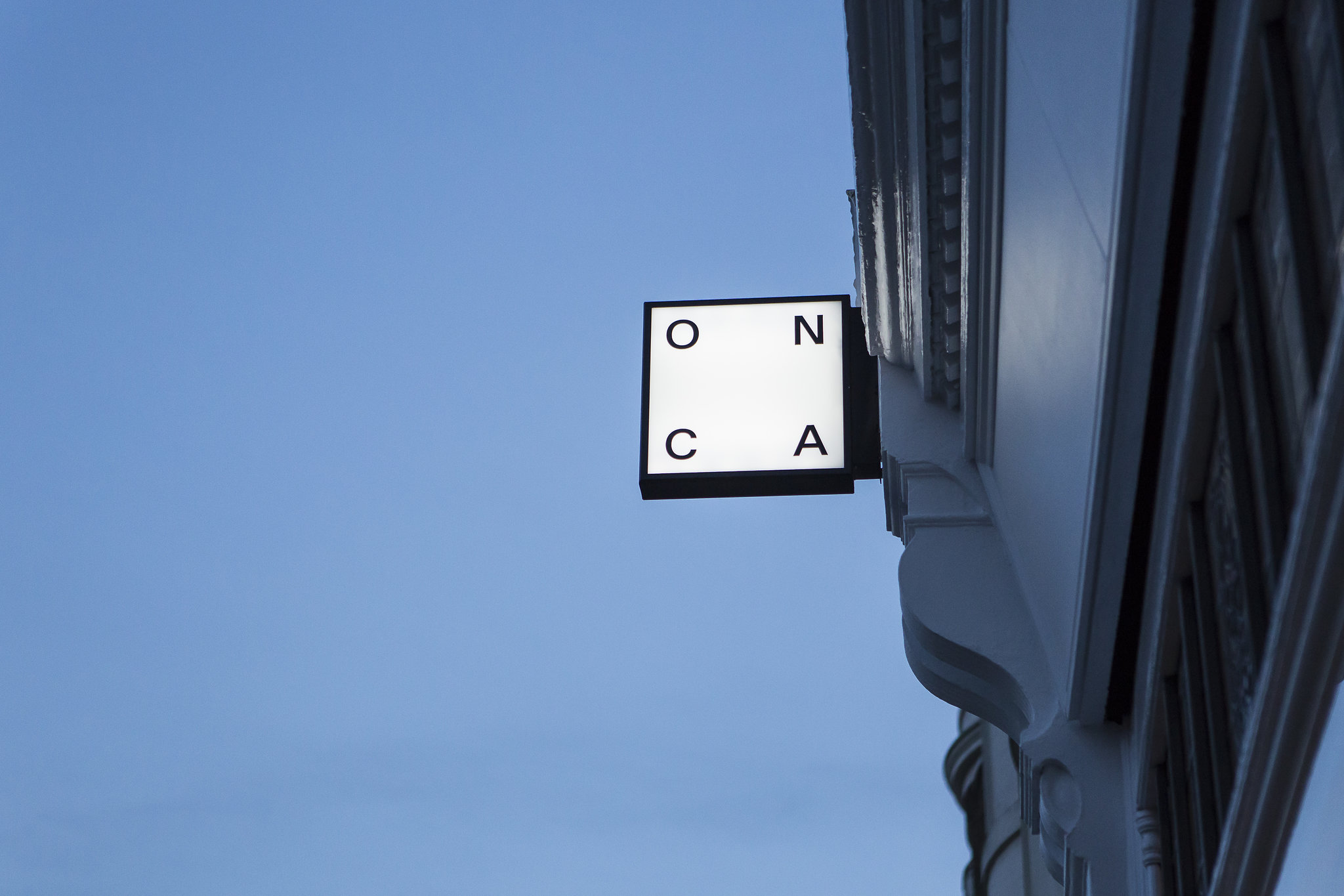
HM: The ONCA light box! The moment we put it into the design proposals we knew the identity was right. It was the perfect illustration of the idea. Painting the façade and having the light box makes you look at the building differently: it draws your eye to the architecture and celebrates the uniqueness of the space.
HM: Although the light box is the most pleasing aesthetically, I’m probably most happy with the letter spacing when ONCA is used in plain text. As a concept, to create an identity that sits in plain text is quite an achievement.
LE: Finally, thank you for encouraging ONCA to be bold and try things that felt uncomfortable. One thing we have learnt through this process is that changing what you’re used to is hard. Do you have any thoughts on that?
HM: Taking risks comes from experience. The decisions we made for ONCA – in particular the spacing – were based on experience and reference to design. We were able to see the potential in the spacing of ONCA and part of our job is to encourage people to take risks and trust our intuition. Most of the time it pays off. There is no right or wrong way of doing things in design – it’s about taking risks and having the confidence to trust the design. There’s always an element of buyer’s doubt: your identity is an investment and there is always that nagging doubt. ‘Should I have spent money on that? Does it look good?’ You came to us because you were ready to hand this over to someone and it’s great that you trusted us. That’s a really big thing for most people.
LE: Thank you Hamish and all the team at Studio Makgill!
All photographs © Debbie Bragg
—
Share on Twitter /
Share on Facebook
Posted on March 16, 2017
Categories: Interviews
Tags: Hamish Makgill
→ Making Paper Swallows for SWAY
← Remembering Michele Angelo Petrone